Thursday, September 12, 2019

This is war, not a garden party!


Let me begin by apologizing for being away, dear readers and stitchers, for so long. Now I probably have no reason to complain. I mean I’m not going through the level of setbacks like Scarlet and Melanie, but sometimes LIFE HAPPENS and this is one of those years where life just keeps throwing things our way. I would complain except I have good friends who have encountered so much worse lately so I will count my blessings and keep my 
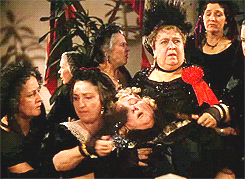
(often big) mouth shut because unlike Aunt Pittypat, I know what’s important. And I think that’s why she is a character I’m so ambivalent about, because she gets wrapped up in “the stuff”... you know the type, they’re all about faux drama. A catastrophic and as I get older I have no time or patience for that kind of nonsense. Don’t get me wrong, I have a healthy respect for etiquette, rules and all that, but to a point. I think Doctor Meade summed it up perfectly when during the taking of Atlanta he tells Aunt Pittypat “Good heavens, woman, this is war, not a garden party!”

After a break from a project for a while, I find the best way to get back into it is to start with something relatively obvious—or obvious to me anyways. The smelling salts bottle is so iconic to Aunt Pittypat... it deserves some bling. At first, I was thinking wonder ribbon but I’m saving that for another area. And I already used Water and Ice for the glass windows so the next obvious thing (to me) to do would be mass beading. I took a class a few years ago and they had us use 2 strands of Accentuate changing the bead thread color to mass bead with clear beads. I’m sure the technique has its merits but after five minutes both myself and my friend I attended with were already highly annoyed...Accentuate stretches and shreds... no thank you! I also recently took a (different) class and that teacher felt strongly about using specialized beading thread to match the bead color. I bead fairly often, a lot of times on a whim so that would require a whole other type of thread I would need to keep on hand which for me just isn’t practical. In the end, I used what I always use for beading, The Collection’s clear beading thread along with their 11/0 crystal (clear) beads. Their beading thread is so versatile and it doesn’t stretch or beak and it is really really strong. Their beads are always perfect. Never any uneven hole sizes, chips or burs. Mill Hill beads are also nice but hard to come by around here. I just love the even look of brick beading in mass. The beads always look so orderly (out pops that OCD again). For the ridge at the top of the bottle, I came up at one edge, fed four beads on my needle all at once and went back down at the other end, I then went back and made a stitch between each beads over one canvas thread and that helped them stand up straight and kept them from bouncing around. For the top knob, I attached a single The Collection sequin in DM4-14 with the same clear bead. In case you aren’t familiar, i did this by coming up in the middle of the round knob, through the sequin, through the bead and then back through the sequin and canvas. There were a few canvas threads that were left uncovered near the knob so I went back in with the purple thread used on the sleeve to cover them up. 

As you may recall, there was a bit of white showing through on the edge of the sleeve. Originally my thought was to attach more lace but now that feels like gilding the lily. Thankfully it’s a woman’s prerogative to change her mind because I decided to stitch a wrapped back stitch using four strands of Splendor in S803 which is not a stark white but I like it. If you aren't familiar with this technique, you should be because it really comes in handy. All-things-needlework guru, Mary Corbet, created a great tutorial on it which you can see HERE. I highly recommend you check it out, as well as other tutorials on her site.


Since Aunt Pittypat’s hair will be dimensional, I won’t be able to do that until towards the end (and by “I” I mean Fidelis who recently taught a fabulous beards and hair class), so all that’s left is her skin. For the shadowed areas, I used Baked Alaska by Planet Earth, the darker shadow of her chin and around the outside were stitched using Splendor S1131 from the Bronze Porcelains card. For the areas of the lightest highlights, I used Splendor S1063 and for the bulk of skin, Splendor S1083 also from the Bronze card. Her cheeks were stitched in S816 from the Santa’s Rosy Cheeks card. All of these were stitched with three strands which is the usual amount I use on an 18 count canvas.

All that is left now is Aunt Pittypat’s features, but something about how these lips are painted bother me. The smile as painted reminds me of a demonic clown (ask my brother, he will tell you, even as a kid, clowns freak me out — they do him too and he had to carry a gun for work!)... not quite the look I’m going for in a frilly maiden lady so I’m going to make a few subtle changes. First of all, I want a color that compliments her purple dress but not so bright she’ll be confused with Belle Watkins, so I went with a pretty Merlot color of Neon Rays N120. But I have to do something about the shape of those lips...so I’m going to make some tweaks. I found the bow of the mouth which luckily is clearly painted, that will be my center. From there I stitched diagonally over two on each side in opposite directions. Then underneath, two straight stitches over one canvas thread in the middle and one diagonal stitch going in the opposite direction on either side to create the bottom lip. If my description has left you confused, which I can’t say I’d blame you, I created this rudimentary drawing to help clarify.  

You might be concerned that there is still some naked canvas where the lips were painted, no need, I just covered them up with the skin color thread. This is an excellent example of why I often prefer working with stranded threads. I know, I know, people don’t want to be bothered... it’s an extra step, I get it, but because I’m covering up a dark color with a light color, I was able to add an extra strand (so four instead of my usual three) and with that no one would never know I reshaped the lips. There are often times I’ve seen nice painted canvases except the facial features are slightly “off”. As long as there is enough room (meaning the head is not too small to make changes), give these a second look and ponder before you buy, sometimes a face can be saved with a few creative tweaks. Like with makeup (or Botox!), don’t be afraid to experiment to create the face you want. 

Since I am not sure what thread we are going to use for her hair, I am skipping the eyebrows for now so all that is left on the face are the eyes which I think really requires a metallic. I’m going to go on record as saying I highly prefer Kreinik metallics to other brands. They don’t kink and I am particularly partial to their vintage line. If it curls when you take it off the spool a light stretch will usually straighten it out. You don’t want it to pop though, stretch slowly and carefully. But nothing’s ever perfect and the only thing I find inconvenient about this brand is the little round labels with the thread size and color number are constantly  falling off! First world problems I know, but it comes into play and you’ll here how... So I can tell you I used a #12 braid Kreinik color 005 - black. And I know that I used a #8 braid color 100 (a white subtle sparkle). But for the blue, I am outta luck because the label is gone like the wind (pun intended, I just couldn’t resist)!  I know it is a #8 Kreinik but I don’t know the exact color. From what I can tell from looking at Kreinik’s website, I think it was color number 684-Aquamarine but I can’t be positive. Anyone who’s ever tried to match a thread using any kind of screen knows how problematic that can be. Mine was a nice aqua/turquoise with a little green twisted in. I like this color because it makes her eyes almost hazel which would look pretty with the purple dress. 

So there we have it. Aunt Pittypat, although bald at the moment, is done for now. Now I get to move on to Ms. Melanie, and I can explain why the older I get, the more I understand what all the fuss is about. 

Until then, keep calm, stitch on...you don’t need silly smelling salts because you got this!

Monday, May 13, 2019

Oh dear where are my smelling salts? I think I shall faint!


Many stories have a character similar to Aunt Pittypat Hamilton. Someone who grounds the story in the past. Not unlike the Dowager Countess in Downton Abbey, she values etiquette very highly. Unlike today, asking “what will people think?” seems is a very relevant point, but unlike the Dowager, she doesn’t have those snappy quick one liners. She does serve her purpose though, she’s setting the scenes of the expectations of society of the time.

In this day and age, I think we’re just used to stronger women. Scarlett is obviously pointedly portrayed as the strongest female character and even in her own quiet way, as is Melanie to a degree, but Aunt Pittypat is just SO delicate (eye roll). And I think thereon lies my ambivalence, I think. On the one hand, as the childless aunt, I get it, a lady needs some help every once in a while but as a modern woman, I was raised to be strong and highly capable. How I long for the days when these roles were much more clearly defined and expectations of society were more clear. But the thing is, she over does it— always pulling out those smelling salts so she doesn’t faint, which actually we now know was often due to either a too-tight corset or being too warm from so many layers of clothing in the heat of the deep south. This is especially so of Aunt Pittypat who is often seen with a shawl and all trussed-up like a thanksgiving turkey, often covered all the way up to her neck— a few things we need to keep in mind when we’re making stitch choices. 

Sometimes designers paint canvases in such a way that it’s difficult to use the particular specialty stitch you want. This was the case with the diamonds across the bust of Ms. Pittypat’s dress. The diamonds are painted at an angle and they’re different sizes. I’m assume this was done to show perspective, so I quickly decided that to stitch right over the painted pattern to create my own grid was probably the easiest way to go. I stitched a Double Hungarian in four strands of Planet Earth Port V 1172 which is an overdyed thread. And notice I’m stitching right over her collar too, we’ll bring that back later, I promise. I then used two strands of DMC 550 to outline the diamonds in a zig-zag pattern and three strands to stitch Nobuko for the solid dark area that look like straps and her empire waist. I flipped the stitch direction of the Nobuko to suit the angles appropriately and stitched basketweave for the verticals empire waistline. I don’t use basketweave/tent, but I always incorporate a bit into every canvas as it gives the eye a place to rest, you can’t have everything be the highlight. Then I stitched Serendipity stitch using the overdyed Planet Earth thread for the area under the waistline, which I think of as her tummy and top of her skirt.


I originally was going to applique purple ribbon for the dark purple/strap-like areas and waistline but it just didn’t look right... it looked too much like suspenders. Just goes to show you, what you think is a given might not always work. And honestly Nobuko is one of my favorite stitches. My students often say think I believe that no canvas is complete without a bit of Nobuko, and they’re probably right because it’s a very versatile stitch. I think I said it before and at the risk of repeating myself, the classics are just that for a reason— because they WORK! 


And speaking of classics, we’re using T stitch (aka alternating basketweave) for the sleeve. This is one of those areas you often encounter where the painting is vague,  where does the shoulder end and the sleeve begin? I have found the best way to treat those kinds of area is use a stitch that doesn’t call attention and let the area just kind of blend in. 

You know what I do want to feature though?  Those dots down either side of her bodice. I don’t know what they are and you can only get an idea that something’s there in our inspiration photo, so I decided sequins would be a good look and I attached them using clear thin quilting thread. It’s a bit of a bear to work with but you can hardly tell they’re attached so it’s worth the aggravation. 

Back to Aunt Pittypat’s trussed-up-ness... we need to do something fabulous with that collar, so I got my hands on a bit of scalloped 1/4 inch doll lace. When you are on your travels and you see bits of lace or trim, or doll buttons, just pick them up for your stash. If your LNS (local needlework shop) doesn’t have what you need, Etsy is also a good way to go. Using the same thin clear quilting thread, I attached the lace using tiny stitches putting subtle little folds as I go which is what will make this lace stand up a bit off the piece and really give dimension. You can obviously attach lace flat but that’s not the look we wanted this time. I did bury the ends of the lace using the loop method that I talked about in my Last Post and I whip-stitched the lace to the back using the same clear thread but you could use one of the purples threads as well. I am pretty pleased with how it came out, if i do say so myself. It is always fascinating to me how it doesn't take much of a little something extra to bring a piece to life.


In our next episode we’ll stitch Aunt Pittypat’s skin, her smelling salts bottle, finish off that sleeve (you didn't think I would leave it that way, did you?) and perhaps talk about her hair. Fidelis is a master with hair techniques but since I know we want dimension, we‘ll probably have to save that to the bitter end...I hate it when I have to be patient! But more to come in our next installment, so stay tuned. And if you haven’t subscribed, please consider doing so and don’t forget to click the link in the email you're receive to verify your subscription (if you don't receive it, please check your junk/spam). And follow Miss Pittypat’s example and spread the word about this blog to your stitching friends.

Monday, January 28, 2019

Curtain call!


In my last post we stitched Tara and talked about that special place on earth that we call home. Like Gerald O’Hara tells Scarlett in one of the early scenes “Land is the only thing in the world worth working for, worth fighting for, because it’s the only thing that lasts”.  If you’re familiar with this movie though, you know what isn’t going to last... those curtains, because in a moment not so unlike the one in “The Sound of Music”, Scarlet has Mamie pull down those drapes to make her an impressive new frock, and she hasn’t had one of those in a very long time. BY the way, Gone with the Wind (the movie) was released in 1939 and Sound of Music in 1965 but the real Maria von Trapp became the von Trapp nanny in and around 1926 but the GWTW book was published in 1936, before The Sound of Music was a movie, just proves that old adage, there’s no such thing as an original idea!  But back to those curtains, they’re the sacrificial lamb because she’s gotta catch herself a man who has a good amount of money and those are difficult to come by even in a less dire economy never mind in times of war! The drapes scene is so iconic that The Carol Burnett Show even did a popular spoof on it. Many of you have probably seen it, I’m sure, but if you’re one of our younger stitchers you may not have and I would be remiss if I didn’t include a link so you could revel in this comic genius:  https://www.dailymotion.com/video/x2z723y


A little trivia told to me by the designer of this canvas, JP Sligh of Labors of Love, if you look closely at Scarlett’s hat that makes up the curtain outfit, it’s been adorned with chicken feet! Can you imagine? We’ll just sparkle our-self up some chicken feet and put them on a hat! I mean you know things are desperate when you are resorting to tricks like that! But an “A+” for originality! You have to use what you’ve got and ingenuity NEVER goes out of style. I was recently telling a good friend, I actually find I am more creative with less options... if you give me every thread in the store, I can’t decide but give me 2 choices and somehow I’m going to “make it work” (in the words of the pinochle of taste and style, Mr. Tim Gund).


So my initial idea was to use green Rainbow Gallery’s Very Velvet but they looked heavy and foreboding. I wanted something that looked fine and expensive (and I have never understood velvet drapes in Georgia to be honest). My LNS still has a stash of Anchor’s Marlitt which I have used for some of the characters’ lips so far. I confess this isn’t one of my favorite threads but these colors  (1031 and 1033) were spot on perfect, so I’m going with it. I’ll be using 4 strands using a vertical brick variation over three. It has an empty space in the middle of each row to show the painting of the canvas that also adds extra shading which I especially like (with no extra work!). And it keeps the drapes from looking too heavy. Word to the wise, Marlitt has been discontinued, so I needed to be certain I would have enough of it. We have all seen the posts on Needlepoint Nation’s Facebook page or had a stitching friend run out of something they now can’t get or the dye-lot has significantly changed. It’s one of a stitcher’s worst nightmares so if you are going to push that envelope and use something discontinued or limited, err on the side of caution and be absolutely certain you have enough! I encourage over buying if that’s what it takes-built in stash enhancement if you will. 

You will notice that I stitched right over Melanie’s veil. I did this when it was over Ashley’s jacket as well... all will be revealed in time, I promise. Any time you over something like this up, take a picture before you stitch it for future reference! 


Now what to do with that fringe? Bullion knots were an option, but I already did a mass of bullions for Bonnie’s hair. Plus, I like to mix techniques within a canvas and I wanted something really different bordering on over the top.... it may be background but it doesn’t mean it can’t shine. It’s always a fine line, you don’t want your background to overtake the design.  B.F. Goodstitch had a trunk show last year of Painter’s Thread and I knew they did great overdyed threads in these glorious colors with sparkle running through them, but I didn’t know about their embellishment trims. I highly recommend you check out their website because you want to be aware of what they have so you will recognize opportunities when they arise. The minute I saw their Klimt Gold Single Loop trim, I knew I had to get it because it’s perfect for our curtains!  And it has slight variations to the dying which I think really adds to it.

This is a thread you couch (aka sew onto the fabric, if you’re a newbie) because it’s very wide. This isn’t wide enough to totally cover the area that is painted for the fringe, so I decided to really gild (get it) the lily and attach two rows, and in one spot three rows of trim after I basket weaved it with Splendor S1012 and S1011 to make sure the canvas was completely covered. Again I reached for my favorite clear beading thread by The Collection to couch (that thread is such a workhorse, so many uses). Also, there is a right side to this particular trim so maybe sure you are attaching the correct side up. You do have to plunge the trim at the beginnings and the ends of each length, otherwise it will unravel- not a good look. But there’s no way we can put this into a needle, so now what? Enter the “loop method”. My main squeeze always says it sounds like a form of birth control (someone get Ms. Pittypatt’s smelling salts—how scandalous!), but it really is such a versatile trick to have in your arsenal. You take any non-strandable thread about six inches long, double it and thread your needle. Using a tapered laying tool or a stiletto, use it to stretch the hole where you want to plunge. Now plunge your needle through the stretched hole, leaving about an inch of the loop on top. Now take about 1/4 of an inch of trim and catch it into the loop and now continue to pull the needle through the hole. Sometimes you to wiggle it a little. Your trim is now on the back, so you can fold the trim  over and neatly whip stitch it to the back while trying to avoid too much bulk.

Ever have a thread too short to bury? Use the loop method in a similar way only burying under existing stitches. This also works if you have a mistake that is isolated, cut just the bad stitch, unpick a few stitches and use the loop method to bury both ends, you can then go back to fill the stitches back in. 

The last aspect of our curtains is the roping and tassel— we stitched over the painted tassel with the white siding of Tara, so it’s time to put it back. And I just so happen to be “partnering” with Fidelis Fenno who has an extra special flare for tassel making. Fidelis grew up going to the Royal School in London and has been teaching tassels here in the States for years. So I (finally) drafted her for assistance. Look at the amazing tiny roping! She made it the same way as you would any twisted cord and the most adorable teeny tiny tassel. I’m not going to go into how she did it because most of us have all made twisted cord and tassels with a piece of cardboard in our childhood. This is fussy work but Fidelis is the MASTER who makes it sound easy. Fidelis advises that you play with how many strands of thread to use because you don’t want it too thin or too chunky, you need to keep the scale in mind, which brings me to another point, we all know Scarlett didn’t make that curtain frock, Mamie did, so don’t be afraid to enlist assistance ... if you have a friend talented at a particular skill/technique, ask for help or a lesson. Stitching is usually a solitary hobby but it’s even more fun when you collaborate (which is why I enjoy teaching needlepoint so much)! Your local needlework shops are a great place for that too. We still have a lot to do on our canvas and I’m afraid the tassel is going to get battered if I attach it now, so I’m going to wait and plunge and attach it towards the end of our project.


And with that our curtains (and Tara for that matter) are complete.


The question now is what to tackle next? I have some wonderful things planned for Melanie but Miss Pittypat has some fun elements too.... who doesn’t love options! While I ponder and scheme my next move, I wish you a very happy new year full of all the thing you love and marvelous stitching. 


Tuesday, September 11, 2018

There's no place like home. . .


Hold on a second, are we in the right movie? Maybe you didn’t know that The Wizard of Oz and Gone with the Wind have more than a few things in common. First and foremost, both originated from books. Both were produced by MGM and directed by David Selznick who must have been a very busy fellow because both were released the same year, 1939, which film experts believe to be the best year in film ever. And at the Oscars, both were nominated for Best Picture (GWTW winner), Best Art Direction (GWTW winner), Music-Original Score (WOZ winner), Outstanding Production (GWTW winner) & Special Effects (neither which is baffling). In all, Gone with the Wind won 10 awards out of 15 nominations whereas Wizard of Oz won 4 awards out of 6 nominations—not that it’s a completion, personally both are 1A and 1B as my favorite movies. But to me the most important thing they share is an ongoing timeless theme and one beloved to my heart: Home

Now I have been told that I often think differently than the masses so if you’re scratching your head, let me explain. Scarlett does everything she can to save her home and Dorothy goes on the journey of a lifetime to return to hers. Both go through unbelievable adventures yet essentially end up where they started, back home. Both movies end leaving you with the impression that brighter days lie ahead for both heroines.

What does that mean in relation to our work in progress? It means I’m stitching Tara, of course! Do you know that most needlepoint projects aren’t completed because people either don’t know what to do with or get bored with stitching their background? I’ve been told this by more than one needlepoint expert and I can see that as being true but not the case here because the designer gave us a built in pattern to which there’s only one logical choice in my mind, cashmere stitch outlined in gray tent. I wanted the cashmere stitches to seam very smooth and flat so for that I’m sorry to have to say it folks, but we’re going to have to strand. Yes I know, I know, no one ever wants to strand, never mind their background, but the look warrants it. And I have a quick tip to help you. I have been stitching “in transit” (train) of late and I find if I strand the whole cut length into little bundles and then wrap them lightly around a finger or two, making a little wheel of the amount of strands I need, they stay neat and then I don’t have to strand every single time I need to start a new thread. I sometimes do several lengths at a time if I need a lot. It just cuts a step out for later. You could even thread up multiple needles and have them ready if you are trying to keep the momentum going. So try pre-stranding and you might not hate it as much. Oh and I’m assuming you all know how to strand properly so it’s not a jumbled mess. In case you don’t, I tap the top of the cut end so the strands fan out, grab a single strand, hold the rest of the strands with my other hand and pull straight...don’t try to separate them like a cheerleader split, that’s where you get into problems. This always works without fail and it will save you a lot of wasted thread and personal headache. And while we’re talking about stranding. I hear the question again and again— three or four stands? For me, on 18 which is usually what I work on, it’s almost always three, but I often like a lighter coverage, but if you are changing the color from what the canvas is painted or need full coverage because you’re covering something up, I suggest four. One thing I like about standing (yes, there IS something to like about stranding) is if whatever you are using isn’t covering, in a pinch (aka too lazy to rip out and start again) you can always go back and add one to two more stands on top of what you’ve already stitched to get the coverage you need- my needlepoint students and I affectionately refer to this as “popping a stitch” (needless to say I have a fun group of students). You can also do that to do very pinpointed padding (like I did with Scarlett’s lips back in this POST—link). Is this technically correct? Probably not, but practicality is always wins out with me, especially when the alternative involves ripping out. So I’m going to strand away because it will lay very flat which is the look I want. I’m using four strands in Splendor 800 in bright white for the white bricks/slats and Pepper Pot Silk Oyster 004 for the gray outlines. I’m using four strands because as you will see, I am going right over a few things again that I’m going to add back later (like Ms. Melanie’s veil and the tassel—more on those in future episodes).


We also need to stitch the shutter. I began by stitching the shading on the right using a cashmere stitch and then tent stitching the shading of the vertical slats in Vineyard Forrest Green C-069. I then used four strands of Splendor 907 to do a cashmere stitch down the right and left sides using the vertical shaded lines as my guide/boundary. That naturally creates the slats across. This is a great example of how you can break up a single color using a series of directional stitches to give it interest and look more realistic. Also notice I reversed the direction of the slant on the slats, as opposed to keeping them the same slant/angle as the sides. I did this for visual interest. It’s subtle but I think it works.


While we’re talking about the concept of home, let’s talk about my second one, my local needlework shop, B.F. Goodstitch. Something bordering on magical happens when I walk through those doors, it’s just comfortable. It doesn’t put on airs, if you love needlework, you’re welcome. The owner, Fidelis (what happened to her? She was supposed to be stitching this too... I think maybe I’m monopolizing the canvas), went to the Royal School of Needlework in the UK. She knows about all kinds of needlework, not just needlepoint. Her knowledge is such an asset because she can help you figure out how to do anything relating to needlework, and I do mean anything. You need to pad Geisha’s hair, she knows precisely how to go about it. You can’t figure out what material to use for raised 3-D cat whiskers, well she just so happens to have horsehair in her stash (no joke, that actually happened). Not a single thread is the right color match for your Sharon G corset canvas, she knows how to manipulate an overdyed thread by flipping it onto itself adding a blending filament and a light stitch to make it all work...she has saved my stitching sanity more than I can count! I always feel so inspired when I’m with her. When I count the blessings of my stitching life, she is the top of my list. That’s another thing about homes, it’s not about the building, it’s about the lives inside, it’s about the people. 

Many years ago Fidelis and I had a conversation about where this art form would be going. We agreed that there was going to be “crossover;” crewelwork/long-and-short, elements of goldwork and stumpwork were all going to start being incorporated and if you follow many of the designers and/or teachers or are even just an observer on the original Needlepoint Nation Facebook group, I’m sure you will agree, that day has come. Hopefully we, as stitchers, will keep evolving which is why education through a local needlework shop is so important! Online shopping may be easy but we need shops to help enable us to build a local needlework community and just as, if not more importantly, provide hands-on education. It’s only through education will we grow as fiber artists. B.F. Goodstitch recently hosted a class with JP Sligh of Labors of Love on how to paint your own needlepoint canvas. JP’s partner in crime, Mark Young, attended too and was great company. It was a surreal moment for me to not only meet the designer of this Gone with the Wind canvas but to have a conversation with him about my progress so far and my plans for the remaining areas. They are both such nice gentlemen and very generous with their talent/knowledge. I’m not usually a picture taker but I just had to get a photo to remember the occasion. 


It was such an educational day. If you have the chance to take JP’s class, you should because the way he teaches do not require  any artistic ability on your part to apply his techniques.

We still have some background left but such an emotional topic has tired me out like a lady who missed their nap at the barbecue, so we’ll cover the remainder of the background next time... we are over the halfway point now, only two characters left and the rest of Scarlett’s dress to finish. Many stitches and techniques still to come so don’t miss an episode, subscribe for updates for delivery to your email.

In the meantime, just remember the moral to both stories ... there’s no place like home. . .  because after all, tomorrow is another day!


Monday, June 25, 2018

“What gentlemen says and what’z they thinks is two different things....and I ain’t noticed Mr. Ashley asking for to marry you....”


Some of the best advice on men I think I’ve ever received! (haha).... but there you go, right from the get-go you know two things, that Mammy knows the ways of the world and that she’s got Scarlett’s number... and does she ever! Poor Mammy has probably been tying to corral her since the day Ms. Scarlett was born and with the likes of this southern belle, that’s no easy feat! What was brilliant about Mammy’s character is not just her bluntness (and ability to somehow get away with it) but Hattie McDaniel’s facial expressions were so marvelous, there are many times she has no dialog at all but you know that she knows just what Scarlett's up to. And while we’re talking about Hattie McDaniel’s acting, it’s no wonder she won the Oscar for best supporting actress. It was truly monumental at the time, it being the first Oscar awarded to an African American acting professional. If you watch her acceptance SPEECH, few rival her grace and humility. She didn’t JUST win an Oscar, she won it the year film critics consider the best year ever in film, 1939. When you look it like that, it puts her on a whole other level.

Unfortunately though, Mammy is in the background on this piece, similar to her position in many scenes, so she can’t be center stage like at the Oscars. We’ll have to excise restraint. I hate that. Why can’t she stand out you ask? Because “it ain’t fittin, it just ain’t fittin”... sorry I couldn’t resist! 


For Mammy, I started with her dress. I’m so glad this canvas designer made it a more lively shade of blue than in the movie. I used the same DMC Floche #800 as we used for Ashely’s vest. Which reminds me of a good point to keep in mind, when your canvas has as much going on as this one does, don’t think you have to use every crayon in the box, feel free to repeat colors across different areas of a piece, it adds a subtle consistency. Like Rhett mentions when talking about the war, “I hate waste”, so why get a whole other color thread when what you have already used works. I stitched Mammy’s dress in a scotch stitch, then a square of basketweave the same size as the scotch, and then the scotch again. I checkerboarded this pattern in rows working across. I didn’t invent this, I have seen this stitch around. I don’t know it’s name, but I do know it’s a handy pattern to have on hand because it isn’t overly boxy but adds a little interest but not too much. I then used Vineyard, C-153 Baltic to stem stitch the shading of Mammy’s dress.

After the dress, I stitched Mammy’s face and hands using three strands of DMC 840 for the bulk of her skin and DMC 838 for the shadowing/shading. So Fidelis has a thing about hands, it is often difficult to get them just right. Remember all the issues I had with Bonnie’s hands?! If you missed it, you can read about it HERE. Since Mammy is in the background, I decided to keep it simple and just basketweaved her hand as it was painted. The thing is, you can’t have everything stand out, otherwise nothing does because you don’t know where to look, so you have to choose your battles. Besides I wanted attention to go elsewhere—more on that in a minute.

Mammy’s eyes are so expressive, they needed to sparkle and shine, I used Kreinik 032 white with iridescent sparkle and 005 in black, both of which are #12 braids. The single black stitches on the furthest left hand side of each eye is a cross stitch to emphasize that “side eye” Mammy so naturally gives. Mammy’s mouth was painted white which I thought looked off. It didn’t make sense to me and thought it looked awkward so I stitched it in Vineyard Caviar which you will hear about later. Which is another good point, if you see something that seems “off”, if it’s a small area, just change it. Your instinct is probably right!

Next I tackled Mammy’s scarves. The neck scarf was stitched using Pepper Pot Silk in Salt 02 with Diagonal Mosaic and Reverse Diagonal Mosaic stitches, similar to what I did with Ashley’s vest actually. I needed something to follow the direction/angle of the scarf and this works but doesn’t overwhelm which is important especially given my plans for the headscarf which I wanted to be the one thing that had a little something extra for this character. After all this, my brain needed a break so I stitched the black background behind Mammy in Vineyard Caviar C-161. I love this color because it’s black with an undertone of blue in it. I decided to go with skip tent because it’s not too dense and I didn’t want the area to get too foreboding or heavy looking.

Mammy’s headscarf was another adventure altogether. Once again I’m back to “do as I say, not as I do” because normally I skip any areas using silk ribbon and tackle them at the end (after stitching, beading and any 3D appliqué) but for the interest of the readers I am breaking that rule and completing each section at a time (Scarlett’s dress was an exception and you’ll find out why towards the end of this project)To make the headscarf more approachable, I mentally divided it into three sections. You could even use a dressmaker’s chalk pencil in light blue or an air erasable pen to help you envision the sections. I then used the Pepper Pot (color Salt) silk thread to pad by making some long directional stitches. You could also use white pearl cotton or even floss but this thread was already in my stitching bag. Keep in mind that any padding stitches should stay one canvas thread inside the area, otherwise you could run into issues trying to cover them up and why make things more difficult for yourself. Here’s what the padding stitches looked like:


Now that we have our shape in, I then used Planet Earth White S002 7mm silk ribbon and stitched right over the padding. A personally like a nicely laid ribbon, I know other people take a more relaxed approach to ribbon claiming the twisting is part of the charm but in this case, I want a smooth almost tight look here so it is time well spent to lay that thread. Notice the ribbon in the middle section is abruptly vertical. Google images of Mammy and you will see why that center section needs to be on top so stitch the sides first and even go into the center section a thread or two (depending how you did your padding), this way you don’t need to worry about gaps in the center section when you do your vertical stitches. I am pretty pleased with how it came out, if I do say so myself! Don’t forget, a little crinkling of the ribbon will make it look more authentic, so you want a nice balance of laid, relatively taunt stitches but not too perfect looking.

Next I went onto the windows. I really like that the designer, Labors of Love, simply shaded the windows. The lines in the panes of glass helped me figure out which direction my stitches needed to slant but I wanted long and short and light. . . enter Kenan stitch again. I have never used this stitch before yet here I am using it again already. . but it feels so different in this application! The painting on these windows is very well done so I used Water N’ Ice WT2 (Water Blue) and WT1 (Transparent Ice /clear) shading as it was painted and it came out even better than I had thought. Water ‘N Ice is another thread you have to lay, and it does shred a little — ok more than a little— let’s just say it shreds, OK?! But there is nothing else like it on the market, at least not that I know of anyways, and it is EXTREMELY versatile so it is a good thread to have in your arsenal. And did you know that it comes in 16 COLORS?! I didn’t! My head is swimming with ideas. The blue, pearl ice and clear  are obviously perfect for water, ice, snow and glass but think of the Flame Red and Flame Orange for well fire, or the Rain Gray for raindrops obviously but also for smoke, and the black for anything witchy (boots, hat, cauldron) or any kind of leather-Santa’s boots and belt perhaps... ooh or any of the brighter colors in varying combinations for a stained glass window... the possibilities are as endless as your imagination so keep these specialty threads in mind.

Once my panes of glass were complete, I started with the window frames. With areas this shape and size I like to do a Diagonal Long Stitch Horizontal\Vertical Stripe (as appropriate) which is basically like a super long Cashmere stitch diagonally over three that you just keep going to fit the area. I used three strands of white Splendor S800 (again you have to lay stranded threads but it makes all the difference) and for the gray part of the window I used Splendor S947 which is a gray with a touch of blue to it. This is the same gray I used for the stripe in Ashley’s shirt. Again, peppering a color throughout a canvas to create consistency so it doesn’t come out looking like a dog’s breakfast.

And here’s how Mammy looks once she’s all stitched up:


 And with that we have completed our spotlight on Mammy. Hopefully we did so with more subtlety than the rustling red petticoat given to her by Rhett. I will say she is defiantly one of the more memorable characters! 

We seem to have hit about the halfway mark...And what happened to Fidelis? I though we were going to share the work... hump! Well maybe she’s like Mammy and is going to stay in the background. That being said, it will be a surprise to me too on which area we are going to work on next so don’t forget to subscribe (and tell a friend, or two or three!) so you don’t miss a single bit!

Until next time, take some advice from Mammy and don’t show your bosom ‘fore 3:00!
(Thank you Turner Classic for this AWESOME meme.)


Tuesday, April 24, 2018

“Frankly my dear.....


....I don’t give a damn.” One of the most famous movie quotes in history, by the time you get to this line in the movie and Rhett finally says it, you just want to stand up and cheer! Finally someone tells Ms. Scarlett they have had enough! And like I said in my last post, he’s my favorite character because he just doesn’t take anyone’s crap! But most of all he’s a survivor above all else and that really appeals to me.


If you know anything else about Rhett Butler, you know that he looks sharp as a tack so I want to impose that with my stitch choices. We already stitched his jacket and skin tone. Now what to do with the color of his shirt? It’s a small area and I wanted the fabric to look like a small check, so I stitched in a skip tent pattern but as a cross stitch in Pepper Pot, color Salt 02 and by doing the stitch as a cross stitch, the stitch appears more square reinforcing they checkered affect. To stitch his eyes, I used a Kreinik (brown) metallic #12 Braid 002. The pupils of Rhett’s eyes on this canvas were painted all black. I thought it made him too sinister looking so I replaced a few stitches with the brown metallic to slightly soften the look. I stitched the mustache and the eyebrows in long and short style diagonal stitches in DMC pearl cotton 5 in black (310). I like the contrast of using a different thread for facial hair than the hair on his head.

Rhett has that dark and handsome thing going on and he has that unflawed jet black hair. I really wanted it to look dark, thick and slick. When you want that dense look in the best thin in my opinion to use is Rainbow Gallery’s Flair. I used black (F501) and just more than a touch of light gray (F591). While we only need a touch of the light gray — and we could have done without— it makes him look distinguished and it helps break up that expanse if black so it’s not too one-note. Similar to how I stitched Ashley’s hair, I found my part line and drew a line with blue dressmakers chalk (which is in a pencil form). I then stitched long and short in both directions leaving the vertical row for the part unstitched/empty. I stitched down the right side first then I worked from the top down on the left side in the black. Once I got to the silver streak, I had both colors going in separate needles at the same time. I will often do this as I find it an easier way to shade. Remember though to maintain good thread management so you don’t get tangled up on the back side. Once I stitched the bulk of the hair, I then went back at the end and stitched tent with the black Flair over the empty vertical part row. I find black much more forgiving when doing hair. It’s so dark and dense it hides a lot of stitching flaws so if you’re cautious about trying “Flair for hair” (I love how that rolls off the tongue), I recommend trying it in black for your first attempt.


As soon as I saw the flower in his lapel, I knew I had to stitch it as a woven ribbon rose. I think it’s rather busy how it’s painted but if you use the right ribbon and simplify, it could really be a feature. When doing woven ribbon roses, you need the appropriate sized ribbon and a matching thread—floss or pearl cotton is fine is that’s all you have but silk ribbon is just luscious. You probably won’t see your thread but having a decent match helps disguise it if it peaks through. I am using Planet Earth Fiber 4mm ribbon in the color Lollipop 011 which has a little over-dyed edge which will look especially nice once it’s woven into a rose. Using 3 strands of DMC 3687 I made a circle of 5 “spokes” in a circular pattern. On smaller flowers you can use 3 or on a larger you can do 7 or 9 but it has to be an odd number so that’s your most important take away. You don’t want your spokes too loose or too tight, remember these are going to create your petals and you don’t want them so tight they over wear your ribbon. Below are my spokes:


Attach your ribbon in the back either by burying it under existing stitches or piercing it with your needle and come up one canvas thread from the center. I tend to like to work clockwise but you can work in either direction as long as you keep going in the same direction. You then go around the clock weaving over and under, over and under. Keep going round and round and as you do, manipulate the ribbon a little so you get some nicely shaped petals. Once the flower seems pretty full, keep going until you make sure you can’t see any of the spokes’ thread and when you are satisfied with your rose, poke your needle under a fat nice petal through to the back of the canvas and end your thread as your normally would when working with ribbon. And here’s my finished rose.
  

If my description wasn’t detailed enough, Sarah Homfray has a great instructional video HERE. If you aren’t familiar with Sarah, she has taught for the Royal School of Needlework and is an enormously talented embroidery teacher. Many embroidery videos can be easily converted to needlepoint especially if you aren’t afraid to pierce the canvas (there isn’t a law against it you know), so if you ever want to try a new to you technique and can’t find a needlepoint video, I highly recommend looking at embroidery videos to help just remember you want the idea of it not the exact science (because this type of needlework work isn’t).

While we’re on the subject of silk ribbon, let’s work on that ascot. Now men’s fashion is not usually my thang but in reviewing some images of Rhett’s character, he has an array of neck adornment. Traditional ties, bow ties and neckerchiefs. I’m going for a broad silk necktie look, not to be confused with the narrower necktie that we’re used to today. To get the effect I am looking for, I decided to use River Silk ribbon in 10mm in color 310. I stitched a couple of long directional stitches about half way down and then long directional stitches on top of those to fill in the length. The stitches that go only about half way provide subtle padding and help with coverage towards the top. With a ribbon this wide, keep a light tension, don’t pull the ribbon to much, let it breath and billow on its own but don’t let it twist, use a laying tool to lay it flat. I prefer one with a rounded tip, not sharp for ribbon work. Then I used The Collection Designs Swarovski Flatback crystal in color 3700 6mm color Crystal which is a gorgeous irredentist purple/pink/green with a single The Collection Designs miyuki size 11 seed bead coincidentally enough in color crystal as the tie tack. The colors in this crystal are perfect for the look I want. It is subtle without being garish, just what it needs. And while I am mentioning The Collection Designs (also know as Embellishing Plus for their crystals, beads, etc.), they also make an awesome beading thread that is totally invisible, yet it’s very strong, and absolutely will not break or stretch. I originally purchased it for beading, which it’s great for, but I also use it for couching especially when I want something to appear to just float on the canvas or if it’s a heavier component, it’s what I always turn to. I would normally wait and do my ribbon and beading as the last components of my design but I’m trying to work in sections for the sake of the blog readers so do as I say, not as I do.

My version of Mr. Rhett is now complete. I think this is the perfect example that proves you don’t have to do anything outrageous to bring a character to life. He looks pretty damn (there’s that works again!) suave, if I do say so myself!


We are chipping away at our Gone With the Wind canvas and like the ladies in the mid-afternoon at the barbecue, I need a nap, although I guarantee if I snuck out, I would not be whipping a vase at Rhett’s head! I’d sense his presence anywhere. Who will make their presence known next? You’ll have to stay tuned to find out!

(To subscribe to The Good Stitch blog, go to the upper right of this page and fill in your email address— don’t forget to click on the verification link in the email you receive at the address you provided. If you are on a mobile device, click on “view web version” at the bottom of this page and then go to the upper right for the subscription box.) 


Wednesday, February 14, 2018

“Heaven help the man who ever really loves you”....


Bet that wasn’t the quote you thought I was going to lead in with, but it pretty much sums up the whole story. When I think of all the unforgettable characters in Gone with the Wind, Rhett Butler has got to be my very favorite. I mean a lot of us are attracted to the bad-boys but he’s not just that, I think he’s multi-faceted in comparison to many of his fellow characters. Let’s face it, everyone else is pretty consistent. Scarlett is selfish, vain and completely self absorbed, Ashley always his wishy-washy idealist self, Melanie the sweet, angelic one and Mammy’s just trying to keep her attitude at an appropriate level. But Rhett, on the other hand, one moment he’s bringing trinkets to Scarlett (and in the book to Miss Pittypat and Melanie too) another a hardened blockade runner but in the midst of a sinking south, he’s the only character with the gumption to tell it like it is — whether you're going to like what you hear or not. In some ways I find him more gentlemanly than the illustrious Ashley, at least he respects women enough to be honest with them. Let’s look at all the great one-liners Rhett has, shall we?
 
I mean those are some unforgettable lines! My personal favorite is the one about being kissed and often and by someone who knows how...wooh whoooo, Miss Pittypat pass me your smelling salts for I dare say my knees get weak at the thought of it!!! If you’ve read the book, and if you haven’t, I highly recommend you do, there are entire characters in the book that are missing from the movie, Rhett’s wardrobe is portrayed more like a dandy, wearing bright snappy colors and always the latest fashions for Paris, so I’m going to keep that in mind and amp up that purple ascot. His stature in the book is also much bigger (more Cary Grant than Clark Gable actually), but I digress.... I decided to start with his suit jacket since is the largest expanse of his outfit. I wanted something that looks almost knitted so I went with Vineyard Merino in Pale Honey (M-1189) and Glazed Ginger (M-1191). This thread has a tight twist so as you stitch you want to let the needle fall and relax that twist a bit. Because this thread has so much texture, I wanted to keep the stitch relatively subtle, the look of a light tweed and Kennan stitch fit the bill perfectly. The empty space within the stitch leaves a little breathing room to show off the character of this thread and keeps the thread from appearing too heavy. It’s slightly loftier than I would normally use on an 18 count canvas but with that bit of breathing room it works. 
 
When you use lighter coverage stitches you need your thread to be a really good match, otherwise you need a stitch with full coverage. This is kind of the situation I ran into with Scarlett’s bow shown below. I know I’m going to put silk ribbon over this area, so I stitched right over the bow and assume that the silk ribbon on top is going to cover enough of the green you don’t see it peaking through the stitch and even if it does you won’t notice because of the bow’s shadow. 


This is why you can’t stitch areas in a vacuum, because as much as you think each area is their own, they aren’t, the piece is layered and you have to approach it that way. I don’t want to have to deal w this area again later if my silk ribbon bow doesn’t completely cover, might as well fill it in completely now and prevent potential headache later.

With Rhett being dark and handsome, the thread pallet we’ve been using for the other characters’ skin shading won’t do. Rhett is slightly darker, more tan, so I’m going to use the Splendor color card in Bronze (as opposed to porcelain, like the others) to help with shading. I know I’ve talked about the Rain Gallery thread cards before but seriously, having so many skin shades in a single card is so convenient. Choose the correct card for the tone you’re using and it’s like half the work is already done for you. For Rhett’s skin I’m using three strands of colors S1085 for the outlines of his face, S1131 for the shadows, S1085 for the checks, S1083 for the highlights, and S1098 as the majority of his skin tone. I’m using all the colors on the card except the darkest one at the bottom. 


If I do say so myself, the colors for Rhett’s skin are spot on, I especially like the blush color which isn’t too pink. You may notice a little something going on with his nose, as I was stitching, I took one long stitch diagonally down the length of his nose from the upper left to the lower right and then basketweaved over it. It’s a quick and easy way to add just a subtle padding to the peak of the nose. I don’t incorporate this on all of the people I stitch but I felt his nose didn’t have enough definition color-wise, again it’s subtle so I’m not sure if you can even notice it in the picture but sometimes the smallest changes are enough to add a bit of character. Here is that subtle padding before it was all covered up (sorry for the bad quality photo).

And here is our Rhett thus far.:

Next time we’re going to deal with Rhett’s hair. NEVER a strand out of place, even while saving dames in the middle of a burning Savannah. And I’ll finish off his other facial features, mustache,  boutonniere and ascot....oh, what to do??? Don’t you worry your pretty little head, I have some interesting ideas in mind, but like Rhett at the political discussion at the BBQ, I know when it’s time to take my leave.....for now....

If you haven’t subscribed yet, please do so to get updates directly in your email inbox, and please help us spread the word about this blog by telling your stitching friends!


Until next time.....

Friday, December 8, 2017

Whipping it up!


As if Bonnie Butler’s story-line wasn’t tragic enough, Bonnie has been giving me a run for my money with this canvas. You remember the saga last time of figuring out what to about her buttons, well the drama continues! I had some moments of inspiration followed by challenges and then some wonderful victories, so the journey has been all over the place, similar to Rhett and Scarlet's marriage come to think of it.


The next component I wanted to tackle was her fabulous whip! I’m hearing that Devo song in my head. . . “Whip It, Whip It Good!”! Right off the bat, I knew I wanted to somehow pad it to give it some shape. You can use all kinds of things for padding, felt (popular in goldwork and stumpwork), Q-tips (both the ends and just the cardboard center portion are great for walking sticks, staffs and all manner of stick like items), and pipe cleaners are all popular choices, but none of these seemed quite right, and then one day inspiration struck. For my regular job, I work a traditional office job and one day I was in our coffee station getting a cup of Joe and it dawns is me, our black mini-straw-like coffee stirrers might be exactly the ticket, and I was green, I literally washed the one I used and brought it home. I cut it to length and tacked it in place at a few different points using black floss and then used Rainbow Gallery Patent Leather in black (PL1) and wrapped it and the canvas underneath to fully hide everything. At both the top and the bottom I had to go around the end first and then up over the top to smooth it out. I will admit that this thread was easier to use than I had expected, however, this being a flat thread and having a back and a front, you have to lay it on both the front and back of your canvas to keep the correct patent side on top so the thread is not twisted. A word to the wise about using this kind of material for padding. This straw is plastic. All along I have had every intention of framing it and given the techniques I'm doing that won't change but if you were planning on doing this technique or an ornament or or a stand up or a pillow, make sure you give your finisher a heads up so in case they iron it, the plastic doesn't melt. It hasn't happened to me, but better safe than sorry. 


Now that the handle is all wrapped, I couched one strand of Kreinik #12 braid 005 (black metallic) above for the straight line above the handle section (which I have since found out--thank you Google-- is call the fall) and back stitched the part you would hit the horse with (which is call the popper). Black Metallic is one of those thread I highly encourage you to keep on hand, even if you don’t have an immediate use for it. It’s great for all kinds of areas from pupils of eyes to wrought iron fences. I wanted some dimension too so off to the local craft store where I found this cool leather cording in the jewelry making section of Michael’s (if you don’t have or like to support big box stores, your local beading stores might have this as well). I only needed a little but I can think of alot of potential future uses so I don’t mind having the left over in my stash. I cut a few inches, widened the holes on either side of the whip, fed it through and then created an over-hand knot to make it really fly off the canvas and cut it to the desired length. The center of this leather is actually brown at the cut areas so here’s that OCD-ness again so I used a sharpie and just touched up the ends. So now I’m going to say to do as I say and not as I do. You might want to hold off on the leather cord until the end. I’ve been catching stitches on it. I’m fine with it because I wanted you to see the affect, but it might slow you down, so feel free to hold off on that last bit of leather cord.


Now what to do with the whip handle going through Bonnie’s hand which I determine  has a glove on it. I knew I wanted to use Neon Rays N22 because it’s the perfect color and with so much texture already going on with Bonnie’s ensemble, why not guild the Lilly and go with rayon thread! First I made 2-3 long verticals stitches for padding to the left of the stirrer/whip handle. I then wrapped the handle/stirred similar to how I covered the handle only one canvas row to the left and stitched in horizontal stitches all the way to the right following the painting of the canvas. I then basketweaved the remainder of the hand/glove.

From this point is where the plot thickens. (Cue the drama!) The next thing I did was use a slightly darker shade of two strands of Anchor Marlitt (which has been discontinued) to make long stitches to give the appearance of dividing lines of the fingers.  This was an epic fail.


When that didn’t work, I took those out and then stitched bullions with my Neon Rays. I have successfully used this for a Melissa Shirley small Santa. That time it worked because the scale of the hand was the same as the bullion. So bullions are not ALWAYS a bad choice, but when I tried it this time, the scale was too small, so that didn’t work. I also tried doing two bullions and wrapping the two together, Neon Rays being a rayon, it kept snagging while I tried to wrap them and quickly became a complete mess so that wasn’t working either. What a disaster! So now what??.....


At this point, it’s late and a school night and I’m tired, (and aggravated, don’t forget about that), so when in doubt, take a deep breath and take it out what you’re unhappy with and give it some more thought in the morning with a clearer head. So for my above mentioned “real” job I have a long commute of over an hour by train and then subway both too crowded for stitching, but built in time to stew—I mean strategize—about my next stitching move. I have long known that stump work often uses wrapped wire for the base of fingers and hands. I found a nifty video online demonstration how (which you can see HERE) but it was more involved than what I needed... but it provided great inspiration. What could I use that would be about the right scale, be easy to work with and easily accessible? Thus enters the humble wire TWIST TIE! Yes, as in the kind on your bread bag. Coffee stirrers? Twist ties? I’m sensing a kitchen theme afoot.

We all have that jar or drawer full of twist ties and elastics and such, I got lucky and had several red ones. If you only have white ones and they have an outer layer of paper (not plastic), you could use a sharpie to make them any color you need (if you do this, make sure you tell your finisher, sharpies have been known to bleed so word to the wise). My ties ended up being a tad too thick, so using tweezers and a pair of my not-best embroidery scissors, I trimmed them down to size by taking a little off both sides and cutting them to the desired length. Using a stiletto/laying tool to open up the holes in my canvas, I maneuvered my wires through the canvas and folded them over to the back. I let them sit slightly off the top of the stirrer so they had a little loft, threaded up my Neon Rays and came up one canvas thread in from the wire and proceeded to wrapped the twist tie laying my Neon Rays. Neon Rays is a flat thread so you want to make sure your thread lays flat as well as you wrap, you might need to manipulate the thread. Once I had it wrapped, I re-pierced the canvas and went to the back, buried my thread and then wrapped my twist tie ends down to my stitches on the back making sure it didn’t get too bulky back there and then trimmed the extra twist tie as necessary. And then I repeated these steps three more times (wait, you may think I’m missing a finger, ohh but I’m not because when you hold something, your hand is in a fist so your thumb is in the back, so we won’t see that - the devil really is in the details!)


Now that I’ve gotten through all these challenges, I was happy to start basketweaving Bonnie’s face. The main skin tone was stitched with Pepper Pot’s Tippy Toes #194, the darker dividing lines was Pepper Pot’s Scallop #035, the shadows on the neck was stitched in Pepper Pot’s Baked Alaska #192 and there are a few highlight stitches down the bridge of her nose, above the blush on her left cheek and under the mouth in four strands of Splendor S1147. Her cheeks were stitched with four strands of Splendor’s S816 (third color down on Rainbow Gallery’s Santa’s Rosy Cheeks card) and her lips in Neon Rays N22. Her lips are a little bright but they are in my inspirational photo too, plus I think it helps tie in the gloves and feathers in her hat so I went with it. And below is our completed Bonnie.


It’s funny, I hadn’t imagined I could fit so much technique into little Bonnie, but I guess I did, how fun! So now what area should we tackle next? You’ll just to stay tuned and find out next time. If you haven’t subscribed to our blog, please do so and encourage your friends (and importantly, don’t forget to click on the activation link to finalize your subscription). If you run into any issues, feel free to leave a comment along with your email and I’ll get back to you.


Until next time, Fidelis and I wish everyone a magical holiday season!