Tuesday, September 11, 2018

There's no place like home. . .


Hold on a second, are we in the right movie? Maybe you didn’t know that The Wizard of Oz and Gone with the Wind have more than a few things in common. First and foremost, both originated from books. Both were produced by MGM and directed by David Selznick who must have been a very busy fellow because both were released the same year, 1939, which film experts believe to be the best year in film ever. And at the Oscars, both were nominated for Best Picture (GWTW winner), Best Art Direction (GWTW winner), Music-Original Score (WOZ winner), Outstanding Production (GWTW winner) & Special Effects (neither which is baffling). In all, Gone with the Wind won 10 awards out of 15 nominations whereas Wizard of Oz won 4 awards out of 6 nominations—not that it’s a completion, personally both are 1A and 1B as my favorite movies. But to me the most important thing they share is an ongoing timeless theme and one beloved to my heart: Home

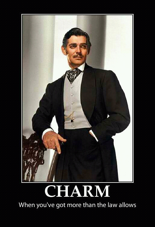
Now I have been told that I often think differently than the masses so if you’re scratching your head, let me explain. Scarlett does everything she can to save her home and Dorothy goes on the journey of a lifetime to return to hers. Both go through unbelievable adventures yet essentially end up where they started, back home. Both movies end leaving you with the impression that brighter days lie ahead for both heroines.

What does that mean in relation to our work in progress? It means I’m stitching Tara, of course! Do you know that most needlepoint projects aren’t completed because people either don’t know what to do with or get bored with stitching their background? I’ve been told this by more than one needlepoint expert and I can see that as being true but not the case here because the designer gave us a built in pattern to which there’s only one logical choice in my mind, cashmere stitch outlined in gray tent. I wanted the cashmere stitches to seam very smooth and flat so for that I’m sorry to have to say it folks, but we’re going to have to strand. Yes I know, I know, no one ever wants to strand, never mind their background, but the look warrants it. And I have a quick tip to help you. I have been stitching “in transit” (train) of late and I find if I strand the whole cut length into little bundles and then wrap them lightly around a finger or two, making a little wheel of the amount of strands I need, they stay neat and then I don’t have to strand every single time I need to start a new thread. I sometimes do several lengths at a time if I need a lot. It just cuts a step out for later. You could even thread up multiple needles and have them ready if you are trying to keep the momentum going. So try pre-stranding and you might not hate it as much. Oh and I’m assuming you all know how to strand properly so it’s not a jumbled mess. In case you don’t, I tap the top of the cut end so the strands fan out, grab a single strand, hold the rest of the strands with my other hand and pull straight...don’t try to separate them like a cheerleader split, that’s where you get into problems. This always works without fail and it will save you a lot of wasted thread and personal headache. And while we’re talking about stranding. I hear the question again and again— three or four stands? For me, on 18 which is usually what I work on, it’s almost always three, but I often like a lighter coverage, but if you are changing the color from what the canvas is painted or need full coverage because you’re covering something up, I suggest four. One thing I like about standing (yes, there IS something to like about stranding) is if whatever you are using isn’t covering, in a pinch (aka too lazy to rip out and start again) you can always go back and add one to two more stands on top of what you’ve already stitched to get the coverage you need- my needlepoint students and I affectionately refer to this as “popping a stitch” (needless to say I have a fun group of students). You can also do that to do very pinpointed padding (like I did with Scarlett’s lips back in this POST—link). Is this technically correct? Probably not, but practicality is always wins out with me, especially when the alternative involves ripping out. So I’m going to strand away because it will lay very flat which is the look I want. I’m using four strands in Splendor 800 in bright white for the white bricks/slats and Pepper Pot Silk Oyster 004 for the gray outlines. I’m using four strands because as you will see, I am going right over a few things again that I’m going to add back later (like Ms. Melanie’s veil and the tassel—more on those in future episodes).


We also need to stitch the shutter. I began by stitching the shading on the right using a cashmere stitch and then tent stitching the shading of the vertical slats in Vineyard Forrest Green C-069. I then used four strands of Splendor 907 to do a cashmere stitch down the right and left sides using the vertical shaded lines as my guide/boundary. That naturally creates the slats across. This is a great example of how you can break up a single color using a series of directional stitches to give it interest and look more realistic. Also notice I reversed the direction of the slant on the slats, as opposed to keeping them the same slant/angle as the sides. I did this for visual interest. It’s subtle but I think it works.


While we’re talking about the concept of home, let’s talk about my second one, my local needlework shop, B.F. Goodstitch. Something bordering on magical happens when I walk through those doors, it’s just comfortable. It doesn’t put on airs, if you love needlework, you’re welcome. The owner, Fidelis (what happened to her? She was supposed to be stitching this too... I think maybe I’m monopolizing the canvas), went to the Royal School of Needlework in the UK. She knows about all kinds of needlework, not just needlepoint. Her knowledge is such an asset because she can help you figure out how to do anything relating to needlework, and I do mean anything. You need to pad Geisha’s hair, she knows precisely how to go about it. You can’t figure out what material to use for raised 3-D cat whiskers, well she just so happens to have horsehair in her stash (no joke, that actually happened). Not a single thread is the right color match for your Sharon G corset canvas, she knows how to manipulate an overdyed thread by flipping it onto itself adding a blending filament and a light stitch to make it all work...she has saved my stitching sanity more than I can count! I always feel so inspired when I’m with her. When I count the blessings of my stitching life, she is the top of my list. That’s another thing about homes, it’s not about the building, it’s about the lives inside, it’s about the people. 

Many years ago Fidelis and I had a conversation about where this art form would be going. We agreed that there was going to be “crossover;” crewelwork/long-and-short, elements of goldwork and stumpwork were all going to start being incorporated and if you follow many of the designers and/or teachers or are even just an observer on the original Needlepoint Nation Facebook group, I’m sure you will agree, that day has come. Hopefully we, as stitchers, will keep evolving which is why education through a local needlework shop is so important! Online shopping may be easy but we need shops to help enable us to build a local needlework community and just as, if not more importantly, provide hands-on education. It’s only through education will we grow as fiber artists. B.F. Goodstitch recently hosted a class with JP Sligh of Labors of Love on how to paint your own needlepoint canvas. JP’s partner in crime, Mark Young, attended too and was great company. It was a surreal moment for me to not only meet the designer of this Gone with the Wind canvas but to have a conversation with him about my progress so far and my plans for the remaining areas. They are both such nice gentlemen and very generous with their talent/knowledge. I’m not usually a picture taker but I just had to get a photo to remember the occasion. 


It was such an educational day. If you have the chance to take JP’s class, you should because the way he teaches do not require  any artistic ability on your part to apply his techniques.

We still have some background left but such an emotional topic has tired me out like a lady who missed their nap at the barbecue, so we’ll cover the remainder of the background next time... we are over the halfway point now, only two characters left and the rest of Scarlett’s dress to finish. Many stitches and techniques still to come so don’t miss an episode, subscribe for updates for delivery to your email.

In the meantime, just remember the moral to both stories ... there’s no place like home. . .  because after all, tomorrow is another day!


Monday, June 25, 2018

“What gentlemen says and what’z they thinks is two different things....and I ain’t noticed Mr. Ashley asking for to marry you....”


Some of the best advice on men I think I’ve ever received! (haha).... but there you go, right from the get-go you know two things, that Mammy knows the ways of the world and that she’s got Scarlett’s number... and does she ever! Poor Mammy has probably been tying to corral her since the day Ms. Scarlett was born and with the likes of this southern belle, that’s no easy feat! What was brilliant about Mammy’s character is not just her bluntness (and ability to somehow get away with it) but Hattie McDaniel’s facial expressions were so marvelous, there are many times she has no dialog at all but you know that she knows just what Scarlett's up to. And while we’re talking about Hattie McDaniel’s acting, it’s no wonder she won the Oscar for best supporting actress. It was truly monumental at the time, it being the first Oscar awarded to an African American acting professional. If you watch her acceptance SPEECH, few rival her grace and humility. She didn’t JUST win an Oscar, she won it the year film critics consider the best year ever in film, 1939. When you look it like that, it puts her on a whole other level.

Unfortunately though, Mammy is in the background on this piece, similar to her position in many scenes, so she can’t be center stage like at the Oscars. We’ll have to excise restraint. I hate that. Why can’t she stand out you ask? Because “it ain’t fittin, it just ain’t fittin”... sorry I couldn’t resist! 


For Mammy, I started with her dress. I’m so glad this canvas designer made it a more lively shade of blue than in the movie. I used the same DMC Floche #800 as we used for Ashely’s vest. Which reminds me of a good point to keep in mind, when your canvas has as much going on as this one does, don’t think you have to use every crayon in the box, feel free to repeat colors across different areas of a piece, it adds a subtle consistency. Like Rhett mentions when talking about the war, “I hate waste”, so why get a whole other color thread when what you have already used works. I stitched Mammy’s dress in a scotch stitch, then a square of basketweave the same size as the scotch, and then the scotch again. I checkerboarded this pattern in rows working across. I didn’t invent this, I have seen this stitch around. I don’t know it’s name, but I do know it’s a handy pattern to have on hand because it isn’t overly boxy but adds a little interest but not too much. I then used Vineyard, C-153 Baltic to stem stitch the shading of Mammy’s dress.

After the dress, I stitched Mammy’s face and hands using three strands of DMC 840 for the bulk of her skin and DMC 838 for the shadowing/shading. So Fidelis has a thing about hands, it is often difficult to get them just right. Remember all the issues I had with Bonnie’s hands?! If you missed it, you can read about it HERE. Since Mammy is in the background, I decided to keep it simple and just basketweaved her hand as it was painted. The thing is, you can’t have everything stand out, otherwise nothing does because you don’t know where to look, so you have to choose your battles. Besides I wanted attention to go elsewhere—more on that in a minute.

Mammy’s eyes are so expressive, they needed to sparkle and shine, I used Kreinik 032 white with iridescent sparkle and 005 in black, both of which are #12 braids. The single black stitches on the furthest left hand side of each eye is a cross stitch to emphasize that “side eye” Mammy so naturally gives. Mammy’s mouth was painted white which I thought looked off. It didn’t make sense to me and thought it looked awkward so I stitched it in Vineyard Caviar which you will hear about later. Which is another good point, if you see something that seems “off”, if it’s a small area, just change it. Your instinct is probably right!

Next I tackled Mammy’s scarves. The neck scarf was stitched using Pepper Pot Silk in Salt 02 with Diagonal Mosaic and Reverse Diagonal Mosaic stitches, similar to what I did with Ashley’s vest actually. I needed something to follow the direction/angle of the scarf and this works but doesn’t overwhelm which is important especially given my plans for the headscarf which I wanted to be the one thing that had a little something extra for this character. After all this, my brain needed a break so I stitched the black background behind Mammy in Vineyard Caviar C-161. I love this color because it’s black with an undertone of blue in it. I decided to go with skip tent because it’s not too dense and I didn’t want the area to get too foreboding or heavy looking.

Mammy’s headscarf was another adventure altogether. Once again I’m back to “do as I say, not as I do” because normally I skip any areas using silk ribbon and tackle them at the end (after stitching, beading and any 3D appliqué) but for the interest of the readers I am breaking that rule and completing each section at a time (Scarlett’s dress was an exception and you’ll find out why towards the end of this project)To make the headscarf more approachable, I mentally divided it into three sections. You could even use a dressmaker’s chalk pencil in light blue or an air erasable pen to help you envision the sections. I then used the Pepper Pot (color Salt) silk thread to pad by making some long directional stitches. You could also use white pearl cotton or even floss but this thread was already in my stitching bag. Keep in mind that any padding stitches should stay one canvas thread inside the area, otherwise you could run into issues trying to cover them up and why make things more difficult for yourself. Here’s what the padding stitches looked like:


Now that we have our shape in, I then used Planet Earth White S002 7mm silk ribbon and stitched right over the padding. A personally like a nicely laid ribbon, I know other people take a more relaxed approach to ribbon claiming the twisting is part of the charm but in this case, I want a smooth almost tight look here so it is time well spent to lay that thread. Notice the ribbon in the middle section is abruptly vertical. Google images of Mammy and you will see why that center section needs to be on top so stitch the sides first and even go into the center section a thread or two (depending how you did your padding), this way you don’t need to worry about gaps in the center section when you do your vertical stitches. I am pretty pleased with how it came out, if I do say so myself! Don’t forget, a little crinkling of the ribbon will make it look more authentic, so you want a nice balance of laid, relatively taunt stitches but not too perfect looking.

Next I went onto the windows. I really like that the designer, Labors of Love, simply shaded the windows. The lines in the panes of glass helped me figure out which direction my stitches needed to slant but I wanted long and short and light. . . enter Kenan stitch again. I have never used this stitch before yet here I am using it again already. . but it feels so different in this application! The painting on these windows is very well done so I used Water N’ Ice WT2 (Water Blue) and WT1 (Transparent Ice /clear) shading as it was painted and it came out even better than I had thought. Water ‘N Ice is another thread you have to lay, and it does shred a little — ok more than a little— let’s just say it shreds, OK?! But there is nothing else like it on the market, at least not that I know of anyways, and it is EXTREMELY versatile so it is a good thread to have in your arsenal. And did you know that it comes in 16 COLORS?! I didn’t! My head is swimming with ideas. The blue, pearl ice and clear  are obviously perfect for water, ice, snow and glass but think of the Flame Red and Flame Orange for well fire, or the Rain Gray for raindrops obviously but also for smoke, and the black for anything witchy (boots, hat, cauldron) or any kind of leather-Santa’s boots and belt perhaps... ooh or any of the brighter colors in varying combinations for a stained glass window... the possibilities are as endless as your imagination so keep these specialty threads in mind.

Once my panes of glass were complete, I started with the window frames. With areas this shape and size I like to do a Diagonal Long Stitch Horizontal\Vertical Stripe (as appropriate) which is basically like a super long Cashmere stitch diagonally over three that you just keep going to fit the area. I used three strands of white Splendor S800 (again you have to lay stranded threads but it makes all the difference) and for the gray part of the window I used Splendor S947 which is a gray with a touch of blue to it. This is the same gray I used for the stripe in Ashley’s shirt. Again, peppering a color throughout a canvas to create consistency so it doesn’t come out looking like a dog’s breakfast.

And here’s how Mammy looks once she’s all stitched up:


 And with that we have completed our spotlight on Mammy. Hopefully we did so with more subtlety than the rustling red petticoat given to her by Rhett. I will say she is defiantly one of the more memorable characters! 

We seem to have hit about the halfway mark...And what happened to Fidelis? I though we were going to share the work... hump! Well maybe she’s like Mammy and is going to stay in the background. That being said, it will be a surprise to me too on which area we are going to work on next so don’t forget to subscribe (and tell a friend, or two or three!) so you don’t miss a single bit!

Until next time, take some advice from Mammy and don’t show your bosom ‘fore 3:00!
(Thank you Turner Classic for this AWESOME meme.)


Tuesday, April 24, 2018

“Frankly my dear.....


....I don’t give a damn.” One of the most famous movie quotes in history, by the time you get to this line in the movie and Rhett finally says it, you just want to stand up and cheer! Finally someone tells Ms. Scarlett they have had enough! And like I said in my last post, he’s my favorite character because he just doesn’t take anyone’s crap! But most of all he’s a survivor above all else and that really appeals to me.


If you know anything else about Rhett Butler, you know that he looks sharp as a tack so I want to impose that with my stitch choices. We already stitched his jacket and skin tone. Now what to do with the color of his shirt? It’s a small area and I wanted the fabric to look like a small check, so I stitched in a skip tent pattern but as a cross stitch in Pepper Pot, color Salt 02 and by doing the stitch as a cross stitch, the stitch appears more square reinforcing they checkered affect. To stitch his eyes, I used a Kreinik (brown) metallic #12 Braid 002. The pupils of Rhett’s eyes on this canvas were painted all black. I thought it made him too sinister looking so I replaced a few stitches with the brown metallic to slightly soften the look. I stitched the mustache and the eyebrows in long and short style diagonal stitches in DMC pearl cotton 5 in black (310). I like the contrast of using a different thread for facial hair than the hair on his head.

Rhett has that dark and handsome thing going on and he has that unflawed jet black hair. I really wanted it to look dark, thick and slick. When you want that dense look in the best thin in my opinion to use is Rainbow Gallery’s Flair. I used black (F501) and just more than a touch of light gray (F591). While we only need a touch of the light gray — and we could have done without— it makes him look distinguished and it helps break up that expanse if black so it’s not too one-note. Similar to how I stitched Ashley’s hair, I found my part line and drew a line with blue dressmakers chalk (which is in a pencil form). I then stitched long and short in both directions leaving the vertical row for the part unstitched/empty. I stitched down the right side first then I worked from the top down on the left side in the black. Once I got to the silver streak, I had both colors going in separate needles at the same time. I will often do this as I find it an easier way to shade. Remember though to maintain good thread management so you don’t get tangled up on the back side. Once I stitched the bulk of the hair, I then went back at the end and stitched tent with the black Flair over the empty vertical part row. I find black much more forgiving when doing hair. It’s so dark and dense it hides a lot of stitching flaws so if you’re cautious about trying “Flair for hair” (I love how that rolls off the tongue), I recommend trying it in black for your first attempt.


As soon as I saw the flower in his lapel, I knew I had to stitch it as a woven ribbon rose. I think it’s rather busy how it’s painted but if you use the right ribbon and simplify, it could really be a feature. When doing woven ribbon roses, you need the appropriate sized ribbon and a matching thread—floss or pearl cotton is fine is that’s all you have but silk ribbon is just luscious. You probably won’t see your thread but having a decent match helps disguise it if it peaks through. I am using Planet Earth Fiber 4mm ribbon in the color Lollipop 011 which has a little over-dyed edge which will look especially nice once it’s woven into a rose. Using 3 strands of DMC 3687 I made a circle of 5 “spokes” in a circular pattern. On smaller flowers you can use 3 or on a larger you can do 7 or 9 but it has to be an odd number so that’s your most important take away. You don’t want your spokes too loose or too tight, remember these are going to create your petals and you don’t want them so tight they over wear your ribbon. Below are my spokes:


Attach your ribbon in the back either by burying it under existing stitches or piercing it with your needle and come up one canvas thread from the center. I tend to like to work clockwise but you can work in either direction as long as you keep going in the same direction. You then go around the clock weaving over and under, over and under. Keep going round and round and as you do, manipulate the ribbon a little so you get some nicely shaped petals. Once the flower seems pretty full, keep going until you make sure you can’t see any of the spokes’ thread and when you are satisfied with your rose, poke your needle under a fat nice petal through to the back of the canvas and end your thread as your normally would when working with ribbon. And here’s my finished rose.
  

If my description wasn’t detailed enough, Sarah Homfray has a great instructional video HERE. If you aren’t familiar with Sarah, she has taught for the Royal School of Needlework and is an enormously talented embroidery teacher. Many embroidery videos can be easily converted to needlepoint especially if you aren’t afraid to pierce the canvas (there isn’t a law against it you know), so if you ever want to try a new to you technique and can’t find a needlepoint video, I highly recommend looking at embroidery videos to help just remember you want the idea of it not the exact science (because this type of needlework work isn’t).

While we’re on the subject of silk ribbon, let’s work on that ascot. Now men’s fashion is not usually my thang but in reviewing some images of Rhett’s character, he has an array of neck adornment. Traditional ties, bow ties and neckerchiefs. I’m going for a broad silk necktie look, not to be confused with the narrower necktie that we’re used to today. To get the effect I am looking for, I decided to use River Silk ribbon in 10mm in color 310. I stitched a couple of long directional stitches about half way down and then long directional stitches on top of those to fill in the length. The stitches that go only about half way provide subtle padding and help with coverage towards the top. With a ribbon this wide, keep a light tension, don’t pull the ribbon to much, let it breath and billow on its own but don’t let it twist, use a laying tool to lay it flat. I prefer one with a rounded tip, not sharp for ribbon work. Then I used The Collection Designs Swarovski Flatback crystal in color 3700 6mm color Crystal which is a gorgeous irredentist purple/pink/green with a single The Collection Designs miyuki size 11 seed bead coincidentally enough in color crystal as the tie tack. The colors in this crystal are perfect for the look I want. It is subtle without being garish, just what it needs. And while I am mentioning The Collection Designs (also know as Embellishing Plus for their crystals, beads, etc.), they also make an awesome beading thread that is totally invisible, yet it’s very strong, and absolutely will not break or stretch. I originally purchased it for beading, which it’s great for, but I also use it for couching especially when I want something to appear to just float on the canvas or if it’s a heavier component, it’s what I always turn to. I would normally wait and do my ribbon and beading as the last components of my design but I’m trying to work in sections for the sake of the blog readers so do as I say, not as I do.

My version of Mr. Rhett is now complete. I think this is the perfect example that proves you don’t have to do anything outrageous to bring a character to life. He looks pretty damn (there’s that works again!) suave, if I do say so myself!


We are chipping away at our Gone With the Wind canvas and like the ladies in the mid-afternoon at the barbecue, I need a nap, although I guarantee if I snuck out, I would not be whipping a vase at Rhett’s head! I’d sense his presence anywhere. Who will make their presence known next? You’ll have to stay tuned to find out!

(To subscribe to The Good Stitch blog, go to the upper right of this page and fill in your email address— don’t forget to click on the verification link in the email you receive at the address you provided. If you are on a mobile device, click on “view web version” at the bottom of this page and then go to the upper right for the subscription box.) 


Wednesday, February 14, 2018

“Heaven help the man who ever really loves you”....


Bet that wasn’t the quote you thought I was going to lead in with, but it pretty much sums up the whole story. When I think of all the unforgettable characters in Gone with the Wind, Rhett Butler has got to be my very favorite. I mean a lot of us are attracted to the bad-boys but he’s not just that, I think he’s multi-faceted in comparison to many of his fellow characters. Let’s face it, everyone else is pretty consistent. Scarlett is selfish, vain and completely self absorbed, Ashley always his wishy-washy idealist self, Melanie the sweet, angelic one and Mammy’s just trying to keep her attitude at an appropriate level. But Rhett, on the other hand, one moment he’s bringing trinkets to Scarlett (and in the book to Miss Pittypat and Melanie too) another a hardened blockade runner but in the midst of a sinking south, he’s the only character with the gumption to tell it like it is — whether you're going to like what you hear or not. In some ways I find him more gentlemanly than the illustrious Ashley, at least he respects women enough to be honest with them. Let’s look at all the great one-liners Rhett has, shall we?
 
I mean those are some unforgettable lines! My personal favorite is the one about being kissed and often and by someone who knows how...wooh whoooo, Miss Pittypat pass me your smelling salts for I dare say my knees get weak at the thought of it!!! If you’ve read the book, and if you haven’t, I highly recommend you do, there are entire characters in the book that are missing from the movie, Rhett’s wardrobe is portrayed more like a dandy, wearing bright snappy colors and always the latest fashions for Paris, so I’m going to keep that in mind and amp up that purple ascot. His stature in the book is also much bigger (more Cary Grant than Clark Gable actually), but I digress.... I decided to start with his suit jacket since is the largest expanse of his outfit. I wanted something that looks almost knitted so I went with Vineyard Merino in Pale Honey (M-1189) and Glazed Ginger (M-1191). This thread has a tight twist so as you stitch you want to let the needle fall and relax that twist a bit. Because this thread has so much texture, I wanted to keep the stitch relatively subtle, the look of a light tweed and Kennan stitch fit the bill perfectly. The empty space within the stitch leaves a little breathing room to show off the character of this thread and keeps the thread from appearing too heavy. It’s slightly loftier than I would normally use on an 18 count canvas but with that bit of breathing room it works. 
 
When you use lighter coverage stitches you need your thread to be a really good match, otherwise you need a stitch with full coverage. This is kind of the situation I ran into with Scarlett’s bow shown below. I know I’m going to put silk ribbon over this area, so I stitched right over the bow and assume that the silk ribbon on top is going to cover enough of the green you don’t see it peaking through the stitch and even if it does you won’t notice because of the bow’s shadow. 


This is why you can’t stitch areas in a vacuum, because as much as you think each area is their own, they aren’t, the piece is layered and you have to approach it that way. I don’t want to have to deal w this area again later if my silk ribbon bow doesn’t completely cover, might as well fill it in completely now and prevent potential headache later.

With Rhett being dark and handsome, the thread pallet we’ve been using for the other characters’ skin shading won’t do. Rhett is slightly darker, more tan, so I’m going to use the Splendor color card in Bronze (as opposed to porcelain, like the others) to help with shading. I know I’ve talked about the Rain Gallery thread cards before but seriously, having so many skin shades in a single card is so convenient. Choose the correct card for the tone you’re using and it’s like half the work is already done for you. For Rhett’s skin I’m using three strands of colors S1085 for the outlines of his face, S1131 for the shadows, S1085 for the checks, S1083 for the highlights, and S1098 as the majority of his skin tone. I’m using all the colors on the card except the darkest one at the bottom. 


If I do say so myself, the colors for Rhett’s skin are spot on, I especially like the blush color which isn’t too pink. You may notice a little something going on with his nose, as I was stitching, I took one long stitch diagonally down the length of his nose from the upper left to the lower right and then basketweaved over it. It’s a quick and easy way to add just a subtle padding to the peak of the nose. I don’t incorporate this on all of the people I stitch but I felt his nose didn’t have enough definition color-wise, again it’s subtle so I’m not sure if you can even notice it in the picture but sometimes the smallest changes are enough to add a bit of character. Here is that subtle padding before it was all covered up (sorry for the bad quality photo).

And here is our Rhett thus far.:

Next time we’re going to deal with Rhett’s hair. NEVER a strand out of place, even while saving dames in the middle of a burning Savannah. And I’ll finish off his other facial features, mustache,  boutonniere and ascot....oh, what to do??? Don’t you worry your pretty little head, I have some interesting ideas in mind, but like Rhett at the political discussion at the BBQ, I know when it’s time to take my leave.....for now....

If you haven’t subscribed yet, please do so to get updates directly in your email inbox, and please help us spread the word about this blog by telling your stitching friends!


Until next time.....